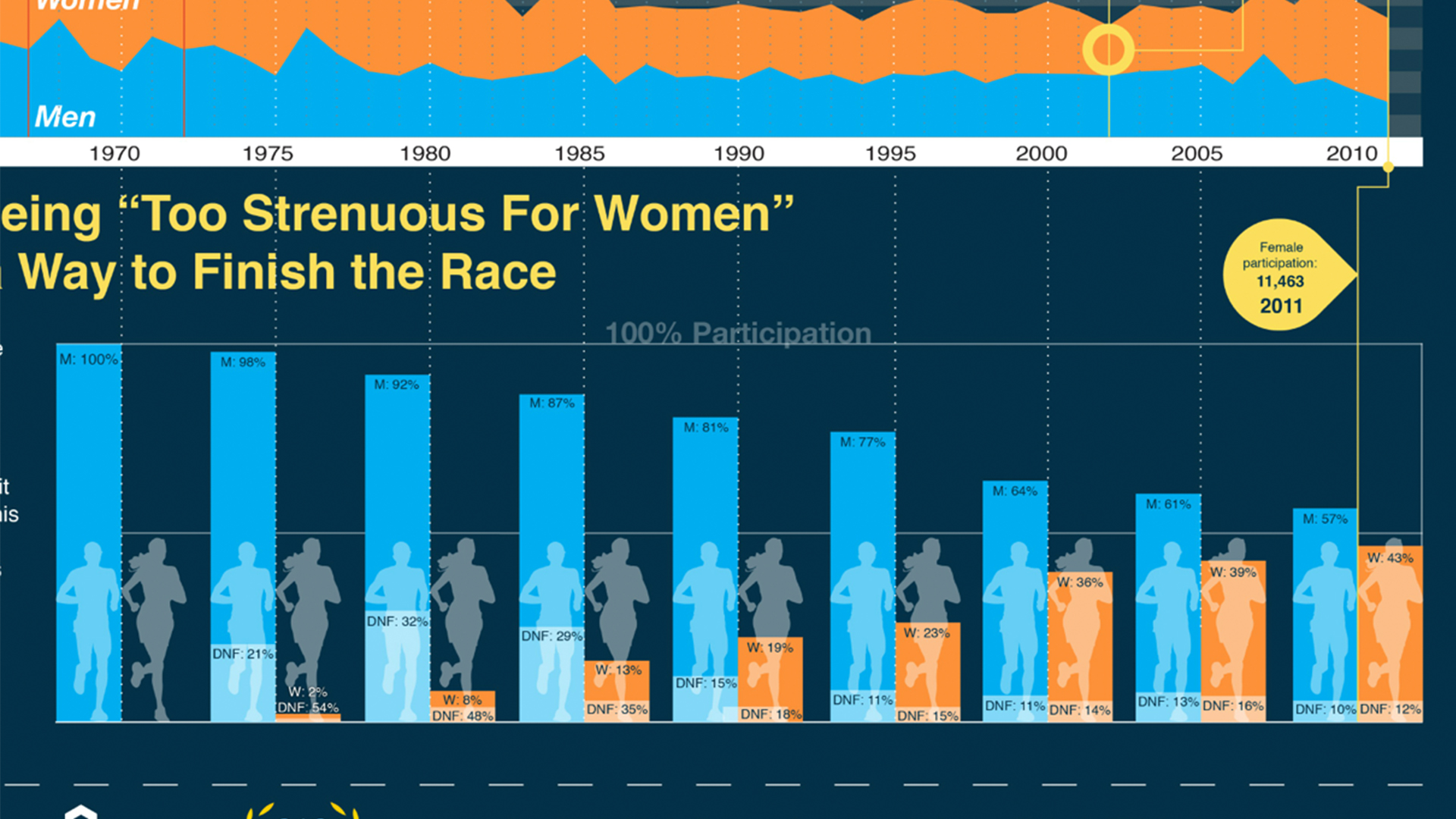
Got a big idea? You need to get it across quickly and efficiently, or modern audiences will move on to the next story clamoring for their attention. Data visualization allows you to make the complex simple, the abstract tangible, and the invisible (data) visible with great illustrations. In this course, Bill Shander shows how to understand your data and your audience, craft the story you need to tell, and determine the best visual model and details to use for that story.
Apply for this course


Media and marketing efforts often rely on data visualizations to quickly prove a point. But poorly designed visualizations can be misleading. Whether it's choosing the wrong charts or graphs, misinterpreting the data, or showing it without context, inaccurate
designs can become a source of global scrutiny.
To succeed in design and marketing today, one must know how to interpret and properly visualize data. This course, developed and led by Killer Infographics CEO, Amy Balliett, walks you through
the ins and outs of creating accurate and compelling data visualizations. Amy focuses on best practices, not tools, although she does provide an overview of Illustrator graphing features. Using these tips, you'll learn how to stand out from the crowd
and create charts and graphs that combine precision with visual appeal.

We are wired for story. We crave it. Storytelling has played an integral role in our ability to make progress. It should come as no surprise, then, that presenting data and information in story form maximizes the effectiveness of our communication. We
can create deeper emotional responses in our audience when we present data in story form.
Join data visualization expert Bill Shander as he guides you through the process of turning "facts and figures" into "story" to engage and fulfill our
human expectation for information. This course is intended for anyone who works with data and has to communicate it to others, whether a researcher, a data analyst, a consultant, a marketer, or a journalist. Bill shows you how to think about, and
craft, stories from data by examining many compelling stories in detail.
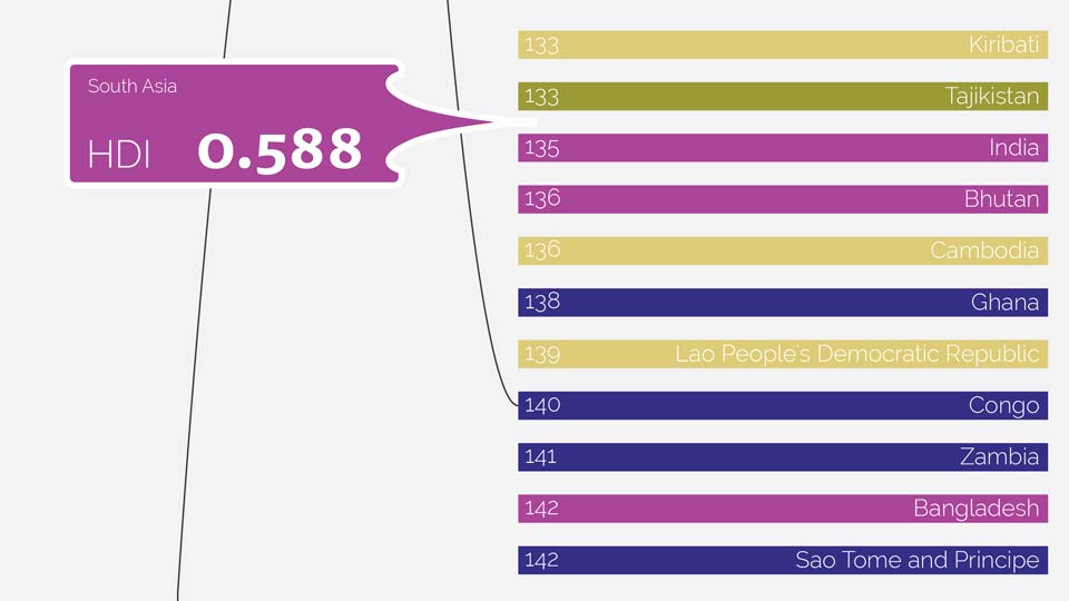
Making "big picture" data relevant for a general audience is a challenging yet common design job. Data visualizations are great solutions; they can illustrate important global issues and bring some of the interesting stories in the data to light.
The
UN Human Development Index used in this course is a perfect example: a composite number used to rank countries on how well they're doing across a range of measures (such as health, wealth, and education). Instructor Bill Shander shows how to make
this index data tangible and approachable by imagining the story and visual approach first. He then builds the design in Adobe Illustrator, capitalizing on some automation and scripting abilities the program offers. Start watching for unique insights
into the entire data visualization process.
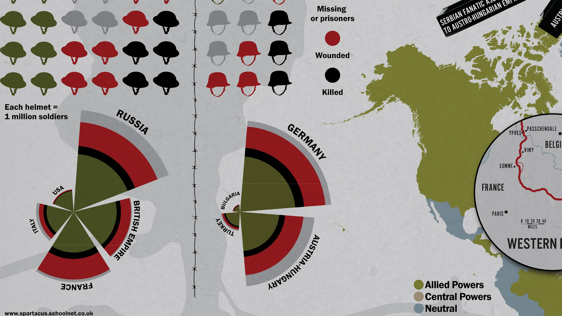
Make your data beautiful; turn it into an infographic. Infographics make complicated information easily understandable and visually compelling. In this course, Nigel French memorializes the soldiers and events of World War I, but you can use these lessons to build almost any kind of infographic. Learn how to use Illustrator, InDesign, Photoshop, and Excel together to analyze and chart the data, plot locations on a map, and build a timeline that simply details a complex sequence of events. Along the way, Nigel explains how to choose fonts and color, create a background image, and finally convert your print graphic into a format suitable for websites.

Many anthropologists believe our early ancestors built societies around campfire stories about justice, leadership, and government. Your data science teams will also have complex ideas about their data and results. That's why it takes a well-structured story to communicate these insights to the rest of your organization. It's not simply a matter of creating the perfect Excel sheet or a beautiful graph. You need to tell a story that captures your audience's imagination and encourages them to take some action. In this course, instructor Doug Rose explains how to weave together a great data science story and draw your audience into the story to communicate complex ideas and motivate everyone to make real changes.

Data visualization is ultimately the make-or-break moment for any data science operation or business analytics project. Develop a solid foundation for how to think about the visual interpretation and communication of data and data insights.
